Project Details
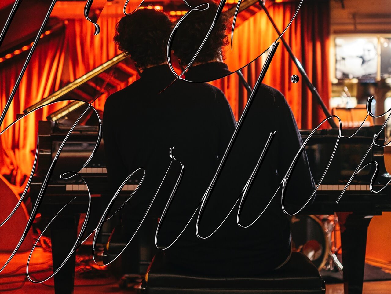
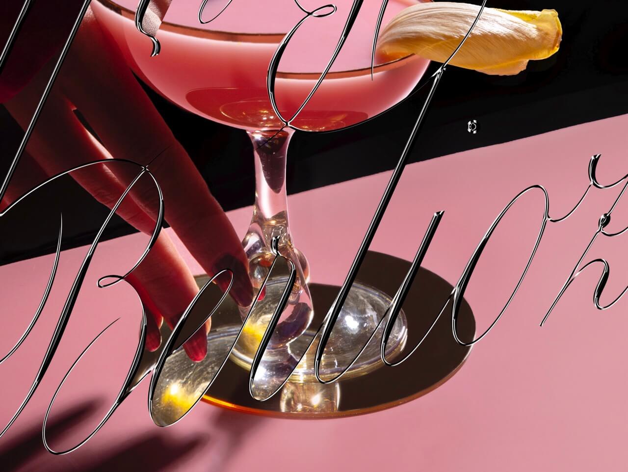
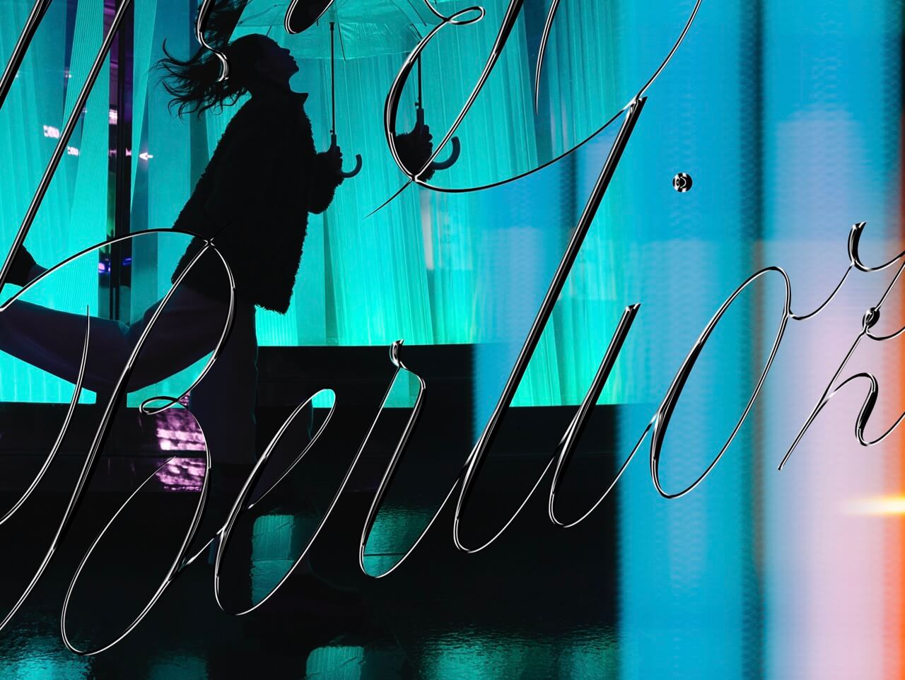
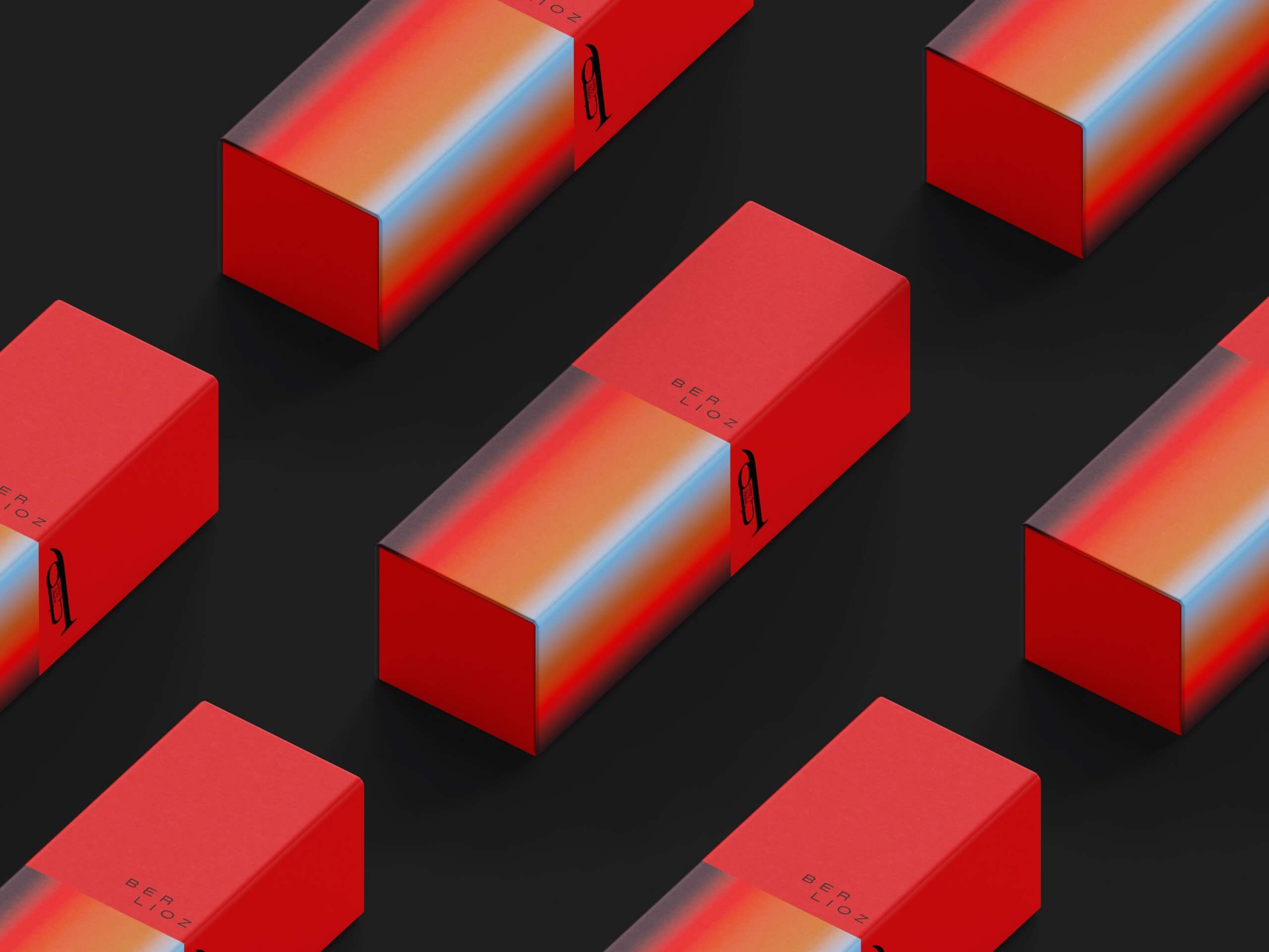
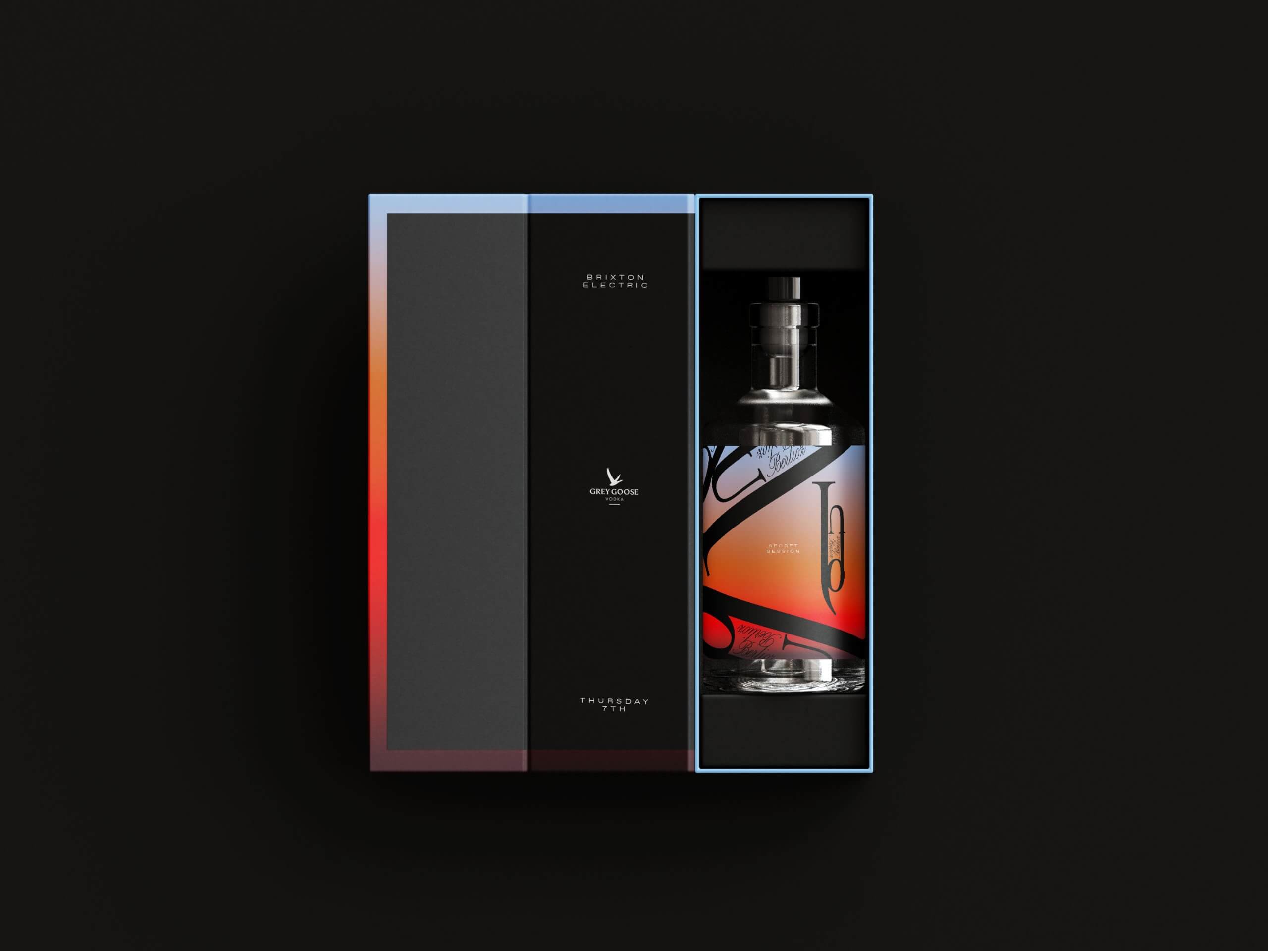
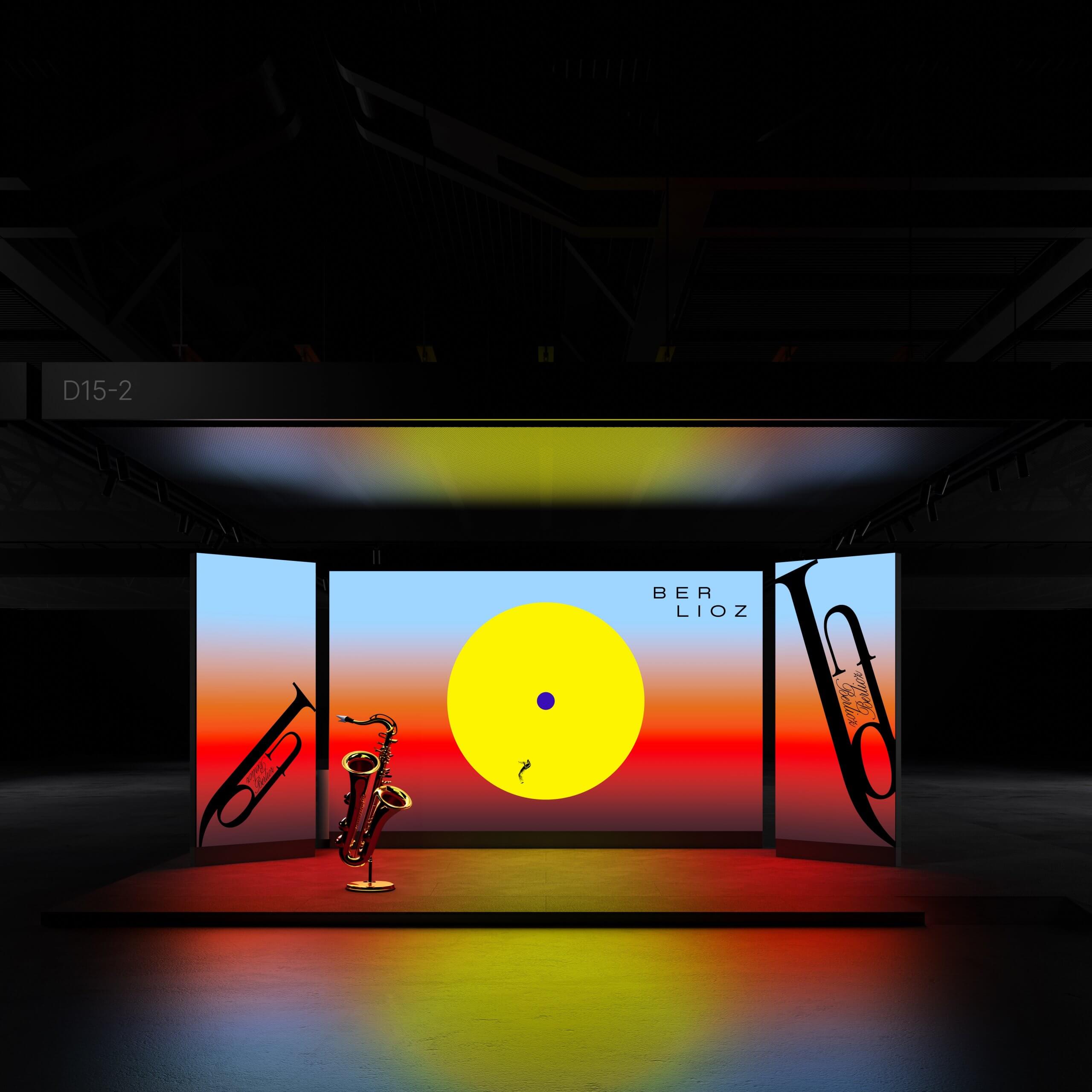
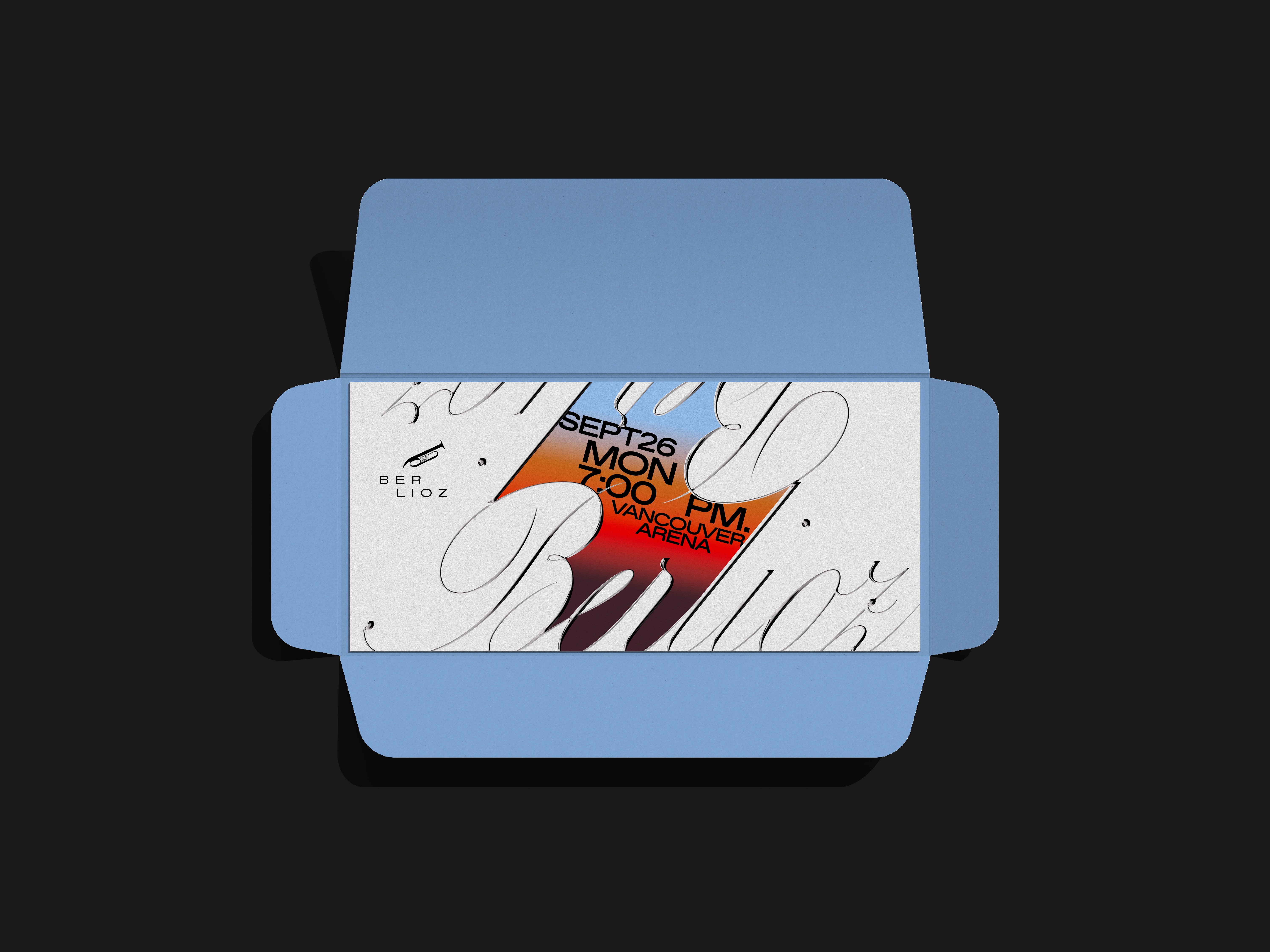
Borderline is a conceptual campaign exploring the intersection of sound, motion, and persona.
Project Type
Creative Exploration
Year
2025

The idea behind the brand:
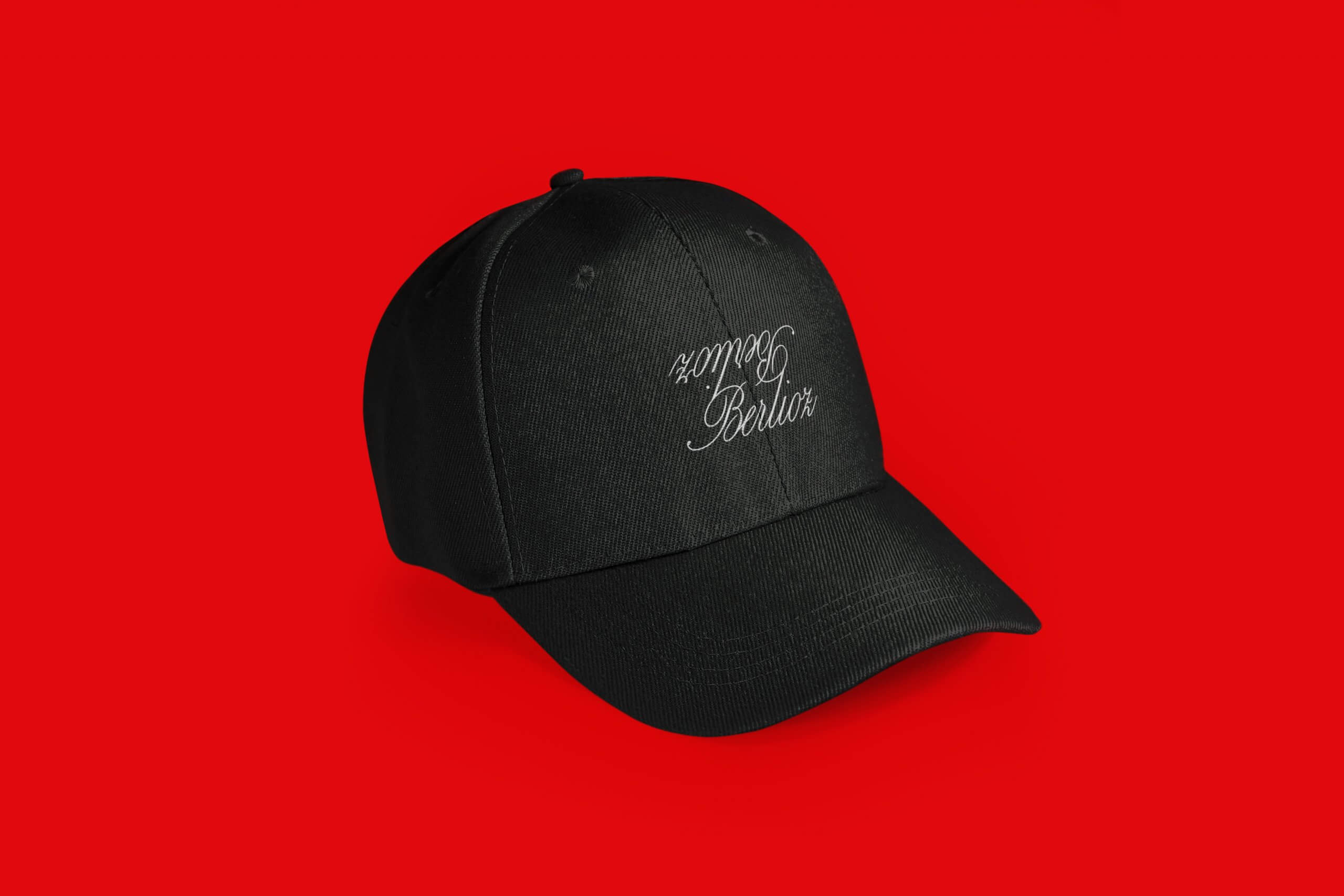
The same Berlioz. *but moody*.
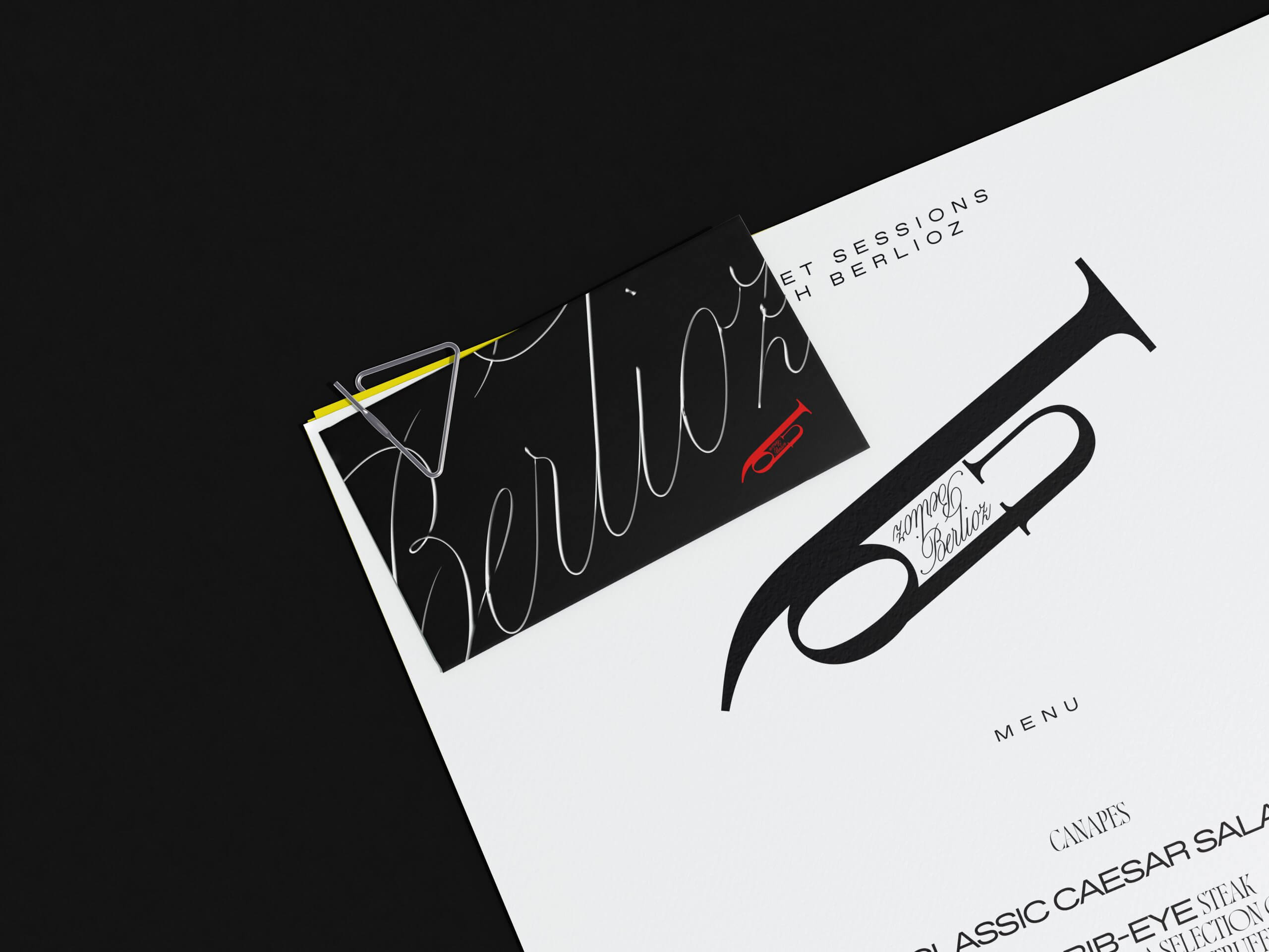
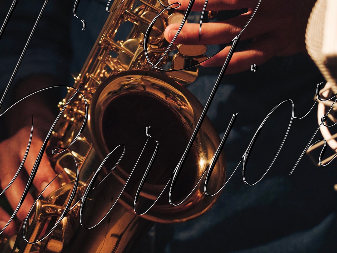
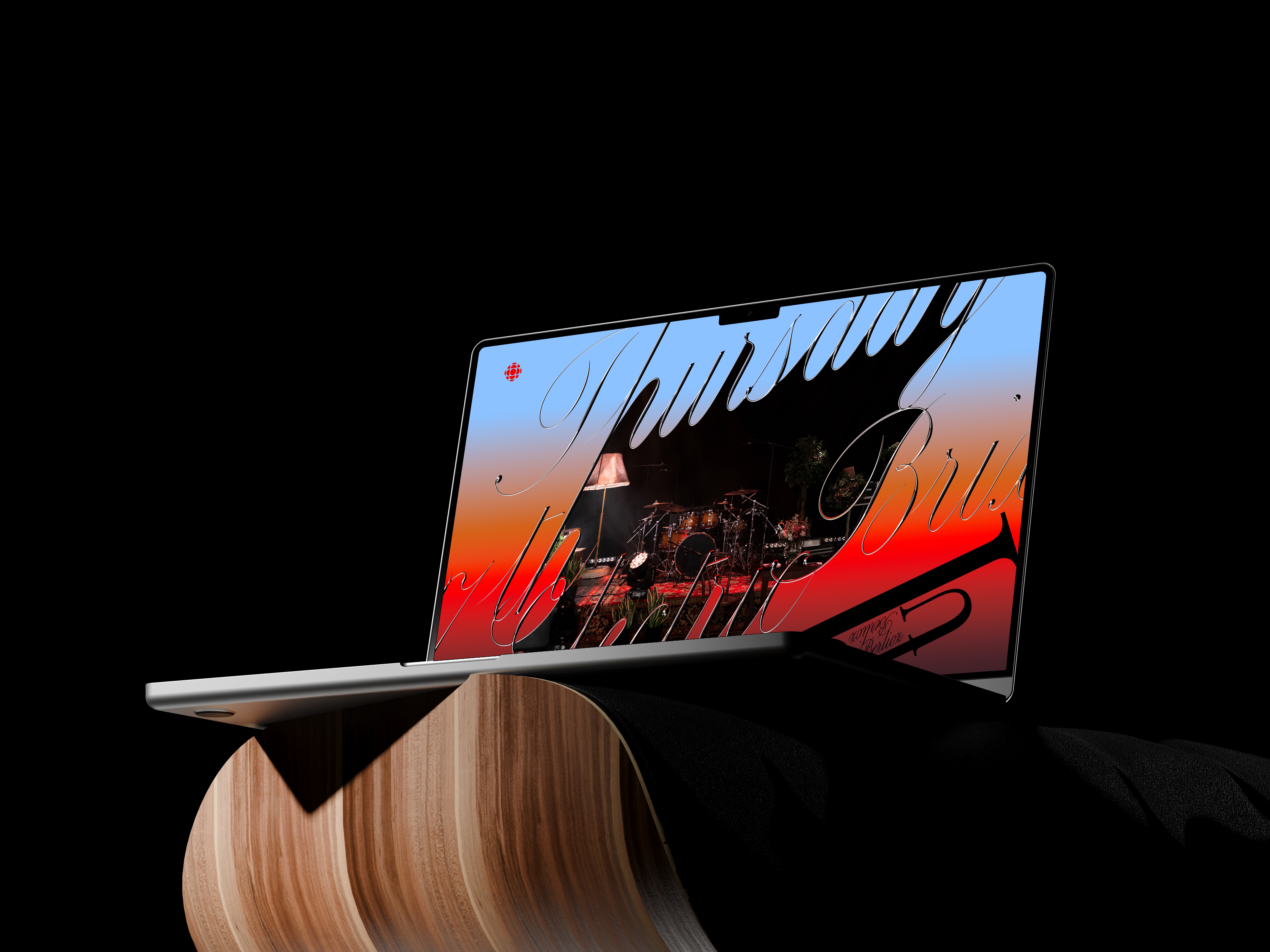
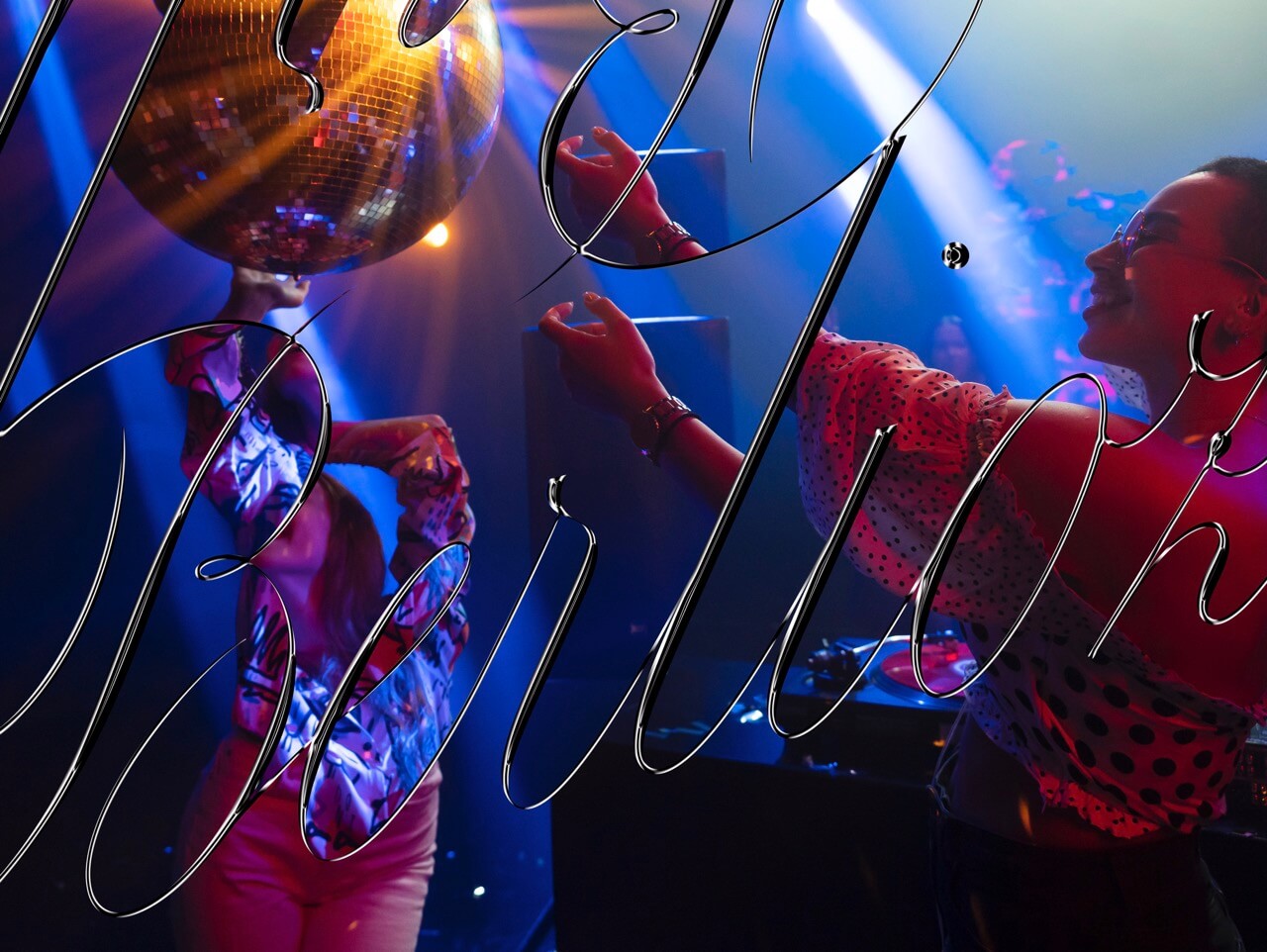
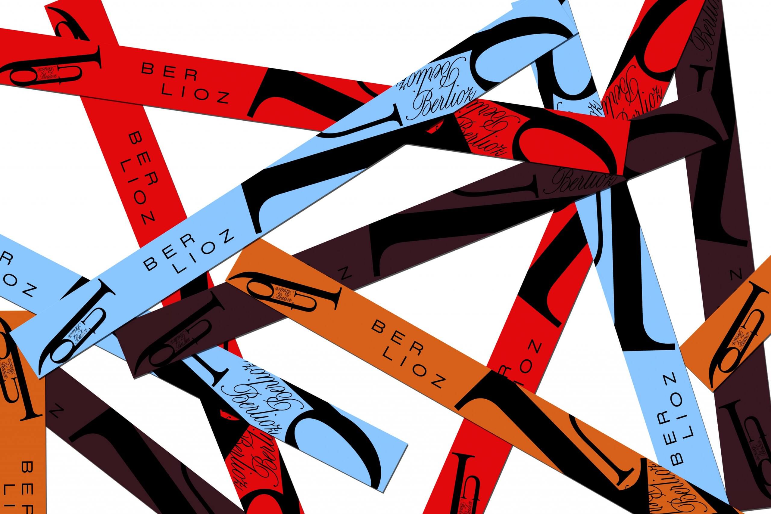
Depict the dynamic energy and rhythm of a new-state house/jazz band with a modern and luxury approach. This concept driven with typography, a merge visuals featuring the delicacy of Carta Nueva, a script font by Sharp Type. And unmatch modern energy from ABC Dinamo Type – Favorit.
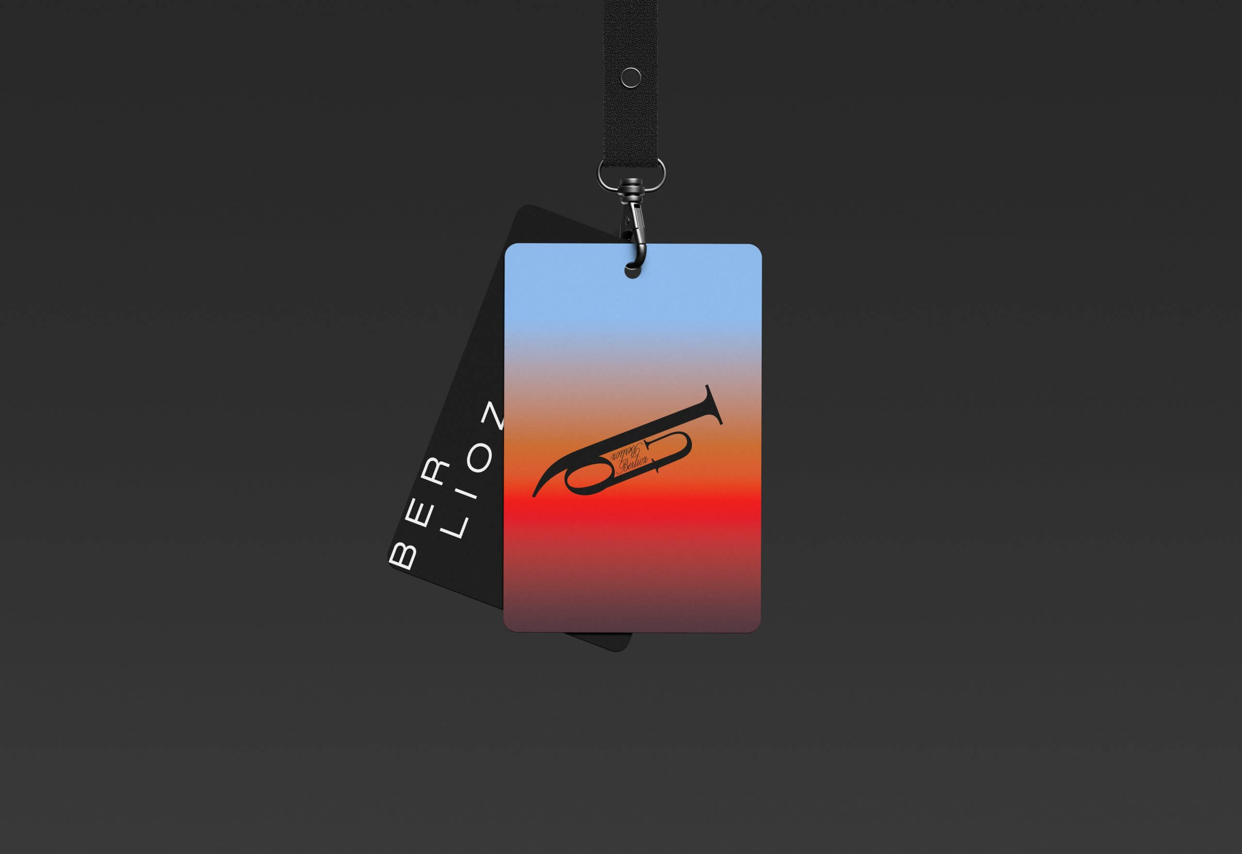
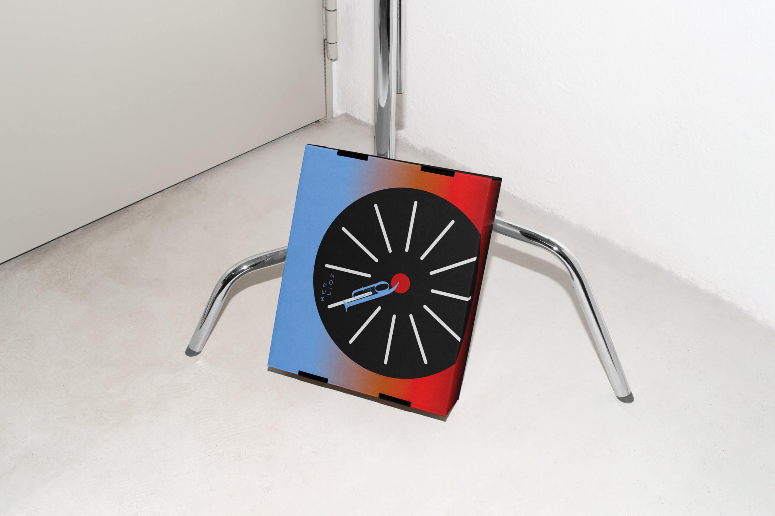
At the heart of the design is a saxophone logo symbol, crafted with characters from Cardinal Fruit by Production Type.
A harmonious blend of both worlds – ultilizing the negative space within the touching letters, where good vibe multiply.
Thank you.Thank you.Thank you.Thank you.Thank you.Thank you.Thank you.Thank you.Thank you.Thank you.Thank you.Thank you.Thank you.Thank you.Thank you.Thank you.Thank you.Thank you.Thank you.Thank you.Thank you.Thank you.Thank you.Thank you.Thank you.Thank you.Thank you.Thank you.Thank you.Thank you.